20. Extra: Ridgeline Plots
Ridgeline Plots
One of the hot new visualization types from recent years is the ridgeline plot. In a nutshell, the ridgeline plot is a series of vertically faceted line plots or density curves, but with somewhat overlapping y-axes. This can be thought of as a contrast to the line plot variation seen in the "Line Plots" part of the lesson, where multiple lines were plotted on the same axes, with different hues. On this page, I'll walk through the creation of a ridgeline plot using some of the demonstration data shown in the "Faceting" page:
group_means = df.groupby(['many_cat_var']).mean()
group_order = group_means.sort_values(['num_var'], ascending = False).index

g = sb.FacetGrid(data = df, col = 'many_cat_var', col_wrap = 5, size = 2,
                 col_order = group_order)
g.map(plt.hist, 'num_var', bins = np.arange(5, 15+1, 1))
g.set_titles('{col_name}')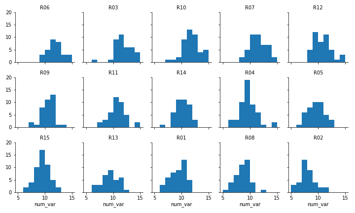
Faceted plot, whose data will be converted into a ridgeline form
Two things immediately come to mind for changing the faceted histograms into a ridgeline plot. First of all, changing the form of the distribution plots from histograms to kernel density estimates (as seen in the Extras of the previous lesson) will make the overlaps a bit smoother. Second, we need to facet the levels by rows so that they're all stacked up on top of one another.
group_means = df.groupby(['many_cat_var']).mean()
group_order = group_means.sort_values(['num_var'], ascending = False).index

g = sb.FacetGrid(data = df, row = 'many_cat_var', size = 0.75, aspect = 7,
                 row_order = group_order)
g.map(sb.kdeplot, 'num_var', shade = True)
g.set_titles('{row_name}')
FacetGrid and set_titles change "col" to "row", also removing "col_wrap". The "size" and "aspect" dimensions have also been adjusted for the large vertical stacking of facets. The map function changes to kdeplot and removes "bins", adding the "shade" parameter in its place.

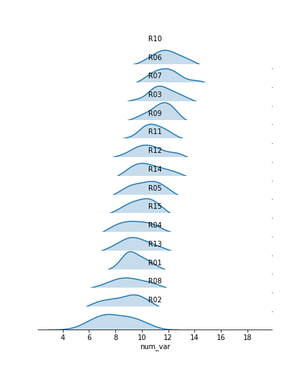
Now we've got all of the group distributions stacked on top of one another for a uni-dimensional comparison, but the plot's still pretty tall. Next, we'll create some overlap between the individual subplots.
group_means = df.groupby(['many_cat_var']).mean()
group_order = group_means.sort_values(['num_var'], ascending = False).index

# adjust the spacing of subplots with gridspec_kws
g = sb.FacetGrid(data = df, row = 'many_cat_var', size = 0.5, aspect = 12,
                 row_order = group_order, gridspec_kws = {'hspace' : -0.2})
g.map(sb.kdeplot, 'num_var', shade = True)

# remove the y-axes
g.set(yticks=[])
g.despine(left=True)

g.set_titles('{row_name}')
I've added the "gridspec_kws" parameter to the FacetGrid call to adjust the arrangement of subplots in the grid through Matplotlib's GridSpec class. By setting "hspec" to a negative value, the subplot axes bounds will overlap vertically. The "size" and "aspect" parameters have also been adjusted. While I'm at it, I'll add some code on the FacetGrid object to remove the y-axis through the despine method and remove the ticks through the set method. They're going to start overlapping, and we don't really need them – we're mostly interested in the relative positions of the distributions rather than specific heights.
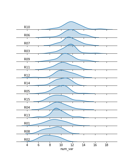
The individual subplots now overlap, but we've still got a problem: the backgrounds of the subplots are opaque, thus obscuring all but the tops of all of the individual group distributions, with the exception of the lowest. In addition, the individual subplot titles overlap the other distributions with some ambiguity: these should be moved elsewhere in the individual plots. The revised code and plot look like this:
group_means = df.groupby(['many_cat_var']).mean()
group_order = group_means.sort_values(['num_var'], ascending = False).index

g = sb.FacetGrid(data = df, row = 'many_cat_var', size = 0.5, aspect = 12,
                 row_order = group_order, gridspec_kws = {'hspace' : -0.2})
g.map(sb.kdeplot, 'num_var', shade = True)

g.set(yticks=[])
g.despine(left=True)

# set the transparency of each subplot to full
g.map(lambda **kwargs: plt.gca().patch.set_alpha(0))

# remove subplot titles and write in new labels
def label_text(x, **kwargs):
    plt.text(4, 0.02, x.iloc[0], ha = 'center', va = 'bottom')
g.map(label_text, 'many_cat_var')
g.set_xlabels('num_var')
g.set_titles('')
We make clever use of the FacetGrid object's map function to perform the plot modifications. Previously, you've seen map used where the first argument is a plotting function, the following arguments are positional variable strings, and any additional arguments are keyword arguments for the plotting function. In actuality, you can set any function as the first argument, which will be applied to each facet. To apply the transparency using map, I set up an anonymous lambda function that gets the current Axes (gca), selects its background (patch), and sets its transparency to full.
As for the second map argument, it sends a pandas Series to the function specified by the first argument. This Series is filtered to include only the column specified by the second map argument, with only the rows appropriate for each facet. In this case, I exploit the fact that the 'many_cat_var' column is filled with copies of the categorical feature string to specify the text string, with hardcoded positional values appropriate to the plot. (map also sends a few general keyword arguments like 'color' automatically to the specified function, hence the need for **kwargs to capture them despite not specifying any myself.) One downside to this approach is that the x-axis labels get replaced with 'many_cat_var' after the map call, thus requiring the addition of a set_xlabels function call to reset the string.
The final ridgeline plot looks like this, where we can see the distribution of our numeric variable on each category, sorted by mean:
Further Reading
- Seaborn: ridge plot example - I actually used this example to clean up my initial attempts. It's got a little bit more aesthetic cleaning than the above demonstration.